
My Role
Description
Design homepage for app and redevelop app navigation.
Who
UI Design - Steven King
UX Design - Steven King
UX Research - Steven King
Prototyping - Steven King
Tools
Figma
When
March 18th, 2023 - April 10th, 2023
The Task
Create a homepage for the app and redevelop the navigation bar to accommodate the homepage
Background
I was originally going to develop the user experience for a mobile fitness application as my third case study. But when I was looking at some competitors to learn from what they have done, I came across this application named JeFit. This application is doing well. Good reviews and a large volume of feedback. I downloaded the application to see what the experience was like and then boom. I opened the app and there was no home page. Then was an onboarding process and then it drops you in the Discover Page. Why is this a problem?
The Problem
I thought that the Discover page was just the home page for the application. But I quickly learned after using the app for a little while that this wasn't the case. There was no home page whatsoever. Whenever you open the application, it drops you in the page you had been using last. This is the problem.


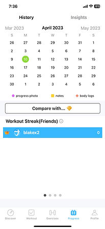
These are some of the potential pages you could see when you open up the application.
I found myself getting very confused when opening the app because of this. I would be wondering where I am or what page I was in. Fortunately, it wasn't leading me into any subpages which would've led to even more confusion. But this was still a major pain point that is incredibly frustrating and noticeable for the users using the application. So, I decided to solve it by designing a homepage.
App Analysis
Since this is an existing application that real users already use, I decided that I would do an analysis of the application. I would see what was predominant in their designs and was needed to be focused on. The Discover Page was the first page that a user will see on first time use so I decided to use that page for my analysis and also it was the closest page to what you would see in a typical home/landing page so it only made sense to so.
The method I used to understand the information hierarchy of their application was a process known as OOUX. It stands for Object Oriented User Experience. It is a process where you seperate elements of a design into 4 catergories and study their relationships not only to the other things on the page but where they are connected to. It also helps me visualize exactly what information people are going to see first. Below are the charts that go into more detail in terms of my examination of the existing JeFit app.

OOUX for the Existing Discover Page

OOUX for the New Home Page
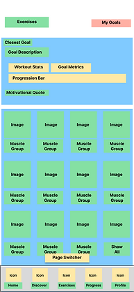
This process helps create the infrastructure of the application, but I personally didn't see the information structure until I placed it on the actual application page. It helps you understand the information that is going on the page and figure out which ones may be more important than others to the users. Below is OOUX placed onto the page to see what is important and what information they prioritized over others.

From what I could see, the original page focused on articles and information for the users to check out. I tried to follow some of the format that they used in their original discover page design and implement it in the new homepage design. I even took some features that was used for the Discover Page and used it in the Home Page design as you can see in the following design.
Some familiarity in terms of where the information is would make this new design more accepted by the existing users. The placement of the information was very important in my decision-making process which is why I believe that the OOUX methodology is so important.
I followed the same process for the Exercises and Workout pages. These renditions are the OOUX of the existing pages while implementing some small changes to them as well to better suit the homepage.
The idea here with the new pages was just to improve upon the UX, not to do an entire overhaul which would cost a lot of money if implemented and a lot of time would've been spent doing so.
Now that we have developed the information architecture for the Home Page, prototypes were my next focus. Primarily, low fidelity.

New Home Page
New Workout Page

New Workout Page
Prototyping And Testing
Most UX Designers would say that it is unorthodox to start prototyping without research. The reason being that we need to find out what people think of the change. We can't do that until we have a basic prototype for people to compare the contents and what they are looking for.
So, the end game of this project is to use the Usability Testing to understand how the change will be received by the consumer.
But we did do some research before jumping in. I used a Competitor Analysis to understand what other successful competitors have done right in order to implement it into the adjusted UI.
Competitor Analysis
I implemented some of our OOUX methodology into the analysis of the competing applications.
Two competing applications were analyzed to see what we can do better.
My Fitness Pal
Home Workout

From the dashboard designs, I came to understand that a lot of them prioritize showing the user their progress through graphs and metrics. These applications are more popular than the Jefit App, so their user experience has been working for their audience.
I learned that showing the user their progress from the moment they open the application is important when it comes to getting users motivated. Which is why I made implementation of that in the new UI.
The New UI
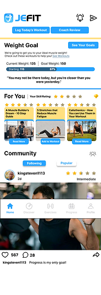
This was the finished design that we used for our testing. We made some UI changes that are meant to give the application more of a professional and complete feel. Some parts of the old application gave the implication that it wasn't finished or that it was amateurish.
Small changes like adding the company logo to the landing page to help users understand who made the app and what part of the application they are at.
Introduced a 5 Star system to help users understand what workouts they should try depending on the experience/skill level. Also introduced the "Closest Goal" Feature which shows the goal the user is closest to completing to help motivate them to finish it.
All these changes were to help user retention and motivate the user not only to use the app but to motivate them to workout.
But testing is needed to see if these changes were actually effective.
The test consisted of a poll of target users who have never used the application before. I showed the old design and then the new design without tell them which one was the old and which one was the new. All I asked was which design they preferred more and why.
From the information received through my simple survey and some interviews with the participants, people were more fond of the original design. 15 Participants. 4 out of 15 chose the new design.
Some have said that the new design format is good but the aesthetic wasn’t as nice. Others said that the new design was too busy. Too much to look at. Too many colors and there was a lot of information.
But one consensus that came from this was that users were fond of the Goal feature and the Star Feature. They said that it was a good way to motivate and gauge your skill.
Some Design changes were made to meet the complaints from the users and then we polled them to see what their thoughts were on the new design.
Original Design
Revised Design


The Results
The New Design was a Success!
I polled the same people who had participated in the original poll letting them see the new design and to get their feedback on it.
There was a resounding satisfaction in the new design in comparison to the old one.
They appreciated the change in color, the new increased spacing on the UI and adding some small photos to make sense of goal that they are currently working on.
I knew I hit the mark when everyone was very happy with the new design. This new design would lead into developing a new design system for the application, color scheme and branding identity. Along with building on the User Experience.
My Takeaways
This project was definitely a different experience than something I had done in the past since I was redesigning an existing application rather than developing something from scratch.
I learned that I need to do more in understanding what good was in the original application. I found myself trying really hard not to get rid of the entire design and start from scratch. Fortunately, the OOUX design process helped me realize what I could use from the old design and just add a slight touch to it. It saved me time in the long run and also helped me make a better design in the end.
I also learned that there is power in simplicity. I knew this before but when I polled the users and got their feedback the first time, I learned just how much people appreciate simplicity and an easily accessible design. Sometimes having a lot of information can be too much in one place. When I redesigned it, I didn't get rid of anything, but I actually ended up adding a bit more information but finding a way to make a lot of information seem simple was the way for me to make a more enjoyable experience as I could see from the results of the second poll.
Overall, I am very happy with the finished design although this is a case study, I would love to help implement this for the Jefit Application.