
My Role
Description
Develop a Prototype of an E-Commerce Product Listing
Who
UI Design - Steven King
UX Design - Steven King
Prototyping - Steven King
Tools
Figma
When
December 8th 2022 - December 16th 2022
The Task
Design a product listing page prototype with full interaction that meets the requirements asked for you.
For privacy reasons, I will not disclose any specific information regarding the task or the company.
I had applied for a UX Designer position at a company in New York City. They had found my resume impressive and asked me to complete the above task. They gave a list of requirements and gave inspiration to follow. The focal point of the project was to let your creativity flow. They really wanted to see something amazing. They wanted to see something that was visually appealing, and they had a very specific vision in mind.
There was no specific product that was being featured in this listing, so a lot of choices were given to us as the designer even though they had a specific vision.
Throughout this project, you will see the requirements that were asked of us and what my design was for each requirement. Then you will ultimately see what their decision was.
Requirement 1: Product Listing Basics
The listing basics shows the product, its price, pictures of the product in action and from different angles. It gives all the basic information about a product that you need to see from a quick glance. Here is the design that I developed for the Overview.

This design emulates a lot of the designs that the company suggested as inspiration.
I was able to implement call to action buttons, product sizing options and a short description of product specifications without compromising space and character sizing.
Due to time constraints, I didn't put every single photo that is available for the product, I only showed three to show the UI associated with it and the interaction abilities as you can see when using the full prototype.
Almost every button leads somewhere on the page. Anything that would lead outside of the page won't work again due to time constraints.
A success of this section was the photo gallery. I had never created something like this before and I was able to figure it out fairly quickly. Getting the interaction to work correctly with the stock Figma animations was new in some ways but I tackled it head on and it worked out great.
A small failure is the sizing options. I would've made a couple of changes. First, people read from left to right, so I would've put the cheaper stock option on the left instead of the right. Second, I didn't show an indication of which one is already selected. I basically gave the user more work to do rather than making their experience easier.
Overall, I am satisfied with how this portion came out but there are improvements to be made.
Requirement 2: Features
The features section showcases the thing that attracted someone to the product. Its usefulness and what situations it would be useful. Here is my design for this section
This design is really just meant for those are really interested in reading the features of the product. Looking back on this, there are some good and bad things about it.
One success of this was having a slideshow that shows the color lights and what other things are including in the package. I think it was also a creative way to show the slideshow. You'll notice that I enjoy using geometric shapes in my designs and the slideshow brings out my style subtly.
What I would've change is the amount of text between pictures. This is partially due to the slideshow but there is far too much text until you hit the next picture. This makes text unreadable because it is hard to maintain attention when it is just a lot of text back to back. Putting a picture that shows more about the function of the product would be helpful in this situation, even a diagram would work as well.
I also would've made a big change that would be a change for the entire page. I would change the fonts. The reason being isn't for visual purposes but for development purposes. Since this is a big block of text and most likely will be skipped over, I would just us a web font to make it easier on the developers of the application. The font that was chosen is similar to some web fonts but I am pretty sure that it isn't one.
Besides those changes, I am still satisfied with the development that was done for this section.
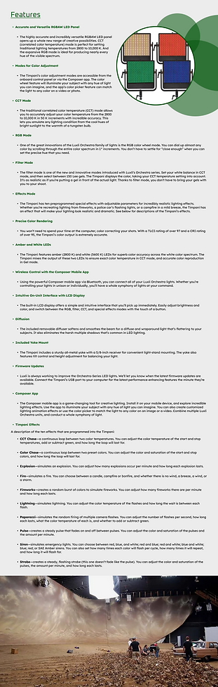
Requirement 3: Specifications
This section shows all the technical specifications that come with the product. I pulled these directly off the product listing and it was a very long list of information.
Since this was just a huge chunk of information that couldn't necessarily be visualized, I decided to opt for a scroll menu. This saved space on the initial page length and allows for users who don't need to look at the specifications to be able to scroll through the page quicker. I also opted to change the background of each line in alternating fashion so that the information doesn't seem as mundane to the user.
A success in this section was the scroll bar. I didn't exactly know how to make a scroll bar in Figma. But Figma makes it easier with the Smart Animate Feature. It allows for some very interesting interactions. In this case, it allowed a Rectangle to act as a functioning scroll bar. It helped me realize that if I learn how to fully manipulate the Smart Animate feature, I could create more interesting interactions in my User Experience.
Requirement 4: Customer Support
This is an interactive support section that links you to resources that are meant to help you if you run into any issues with the product.
My approach to this was to make a mini menu that has a miniature navigation that can still be used to find what you need. The task guidelines called for breadcrumbs in the design, so I took the opportunity to add a small green bar below each page and it moves to the page that you're currently viewing. (i.e. Will move to Documentation if you click on Documentation)
Since the information I used for this task is information from a real product listing, I was able to link the product support information into each button in this section, so it actually leads to the real information about this product. This section especially called for many buttons, so I had to link them all to their respective destinations.
Overall, I am very happy with this section. I would have liked to have it tested to see if the mini navigation bar was perceived as intended but I believe it worked out great!
The Prototype
The Verdict
Although I was very satisfied with how the design came out and I met the requirements asked of me, the company decided to go with a different candidate. Unfortunately, I was not given a reason as to why they decided to go with a different candidate but I am left to believe that the other candidate had created something that is more along the lines of what their vision was.
This was still a learning lesson for me. I had learned some new skills in regard to Figma and I had never really done an E-Commerce Listing before so that was also a new experience for me. I enjoyed doing the project so it wasn't a waste of time for me. It has ehanced my abilities as a UX Designer.